
Grid Layout
Grid
CSS Grid Layout excels at dividing a page into major regions or defining the relationship in terms of size, position, and layer, between parts of a control built from HTML primitives.
display: grid;first
.container {
    display: grid;
    grid-template-columns: 100px auto 100px;
    grid-template-rows: 50px 50px;
    grid-gap: 3px;
}
.container {
    display: grid;
    grid-template-columns: 100px auto;
    grid-template-rows: 50px 50px 200px;
    grid-gap: 3px;
}
fraction unit
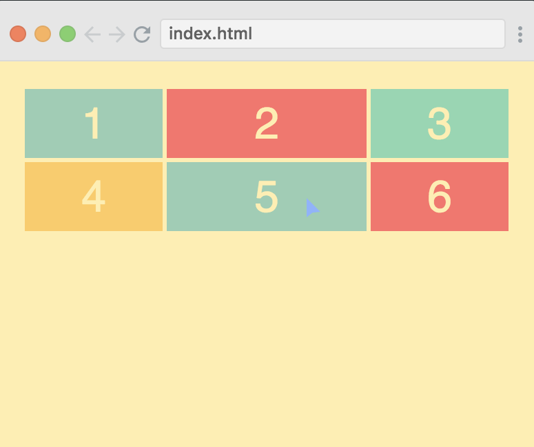
.container {
    display: grid;
    grid-template-columns: 1fr 2fr 1fr;
    grid-template-rows: 50px 50px;
    grid-gap: 3px;
}
repeat
grid-template-columns: repeat(3, 1fr);
grid-template-rows: repeat(2, 50px);grid-template: repeat(2, 50px) / repeat(3, 1fr); // same aboveposition items
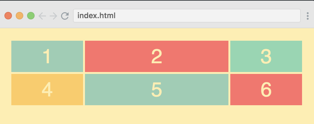
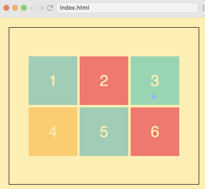
.container {
display: grid;
grid-gap: 3px;
grid-template-columns: repeat(12, 1fr);
grid-template-rows: 40px 200px 40px;
}
.header {
grid-column: 1 / -1;
}
.menu {
grid-row: 1 / 3;
}
.content {
grid-column: 2 / -1;
}
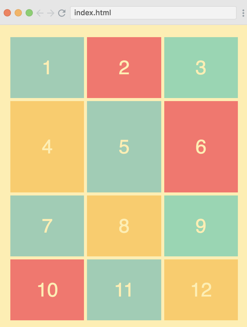
.footer {
grid-column-start: 1;
grid-column-end: 13;
// the same
// grid-column: 1 / span 12;
// the same
// grid-column: 1 / -1;
}
summary
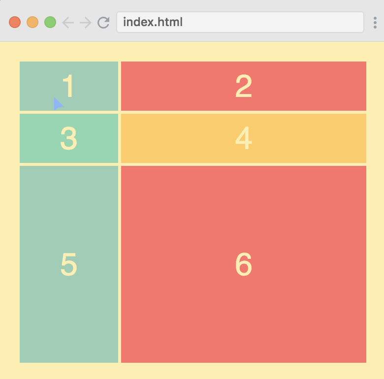
以上例子的 container 是不指定宽高的, 但 container 的宽总是等于父控件, container 的高是子控件高度之和.
不指定宽高的 div, 在横向布局中, 设置为 1fr 或 auto 是会撑满横向的, 但在竖直方向设置 1fr 或 auto 是不起作用的, 此时子控件总是最矮.
如果设置了宽高, 那么 fr 或 auto 会按比例布局.
.container {
    height: 100%;
    display: grid;
    grid-gap: 3px;
    grid-template-columns: repeat(12, 1fr);
    grid-template-rows: 40px auto 40px;
}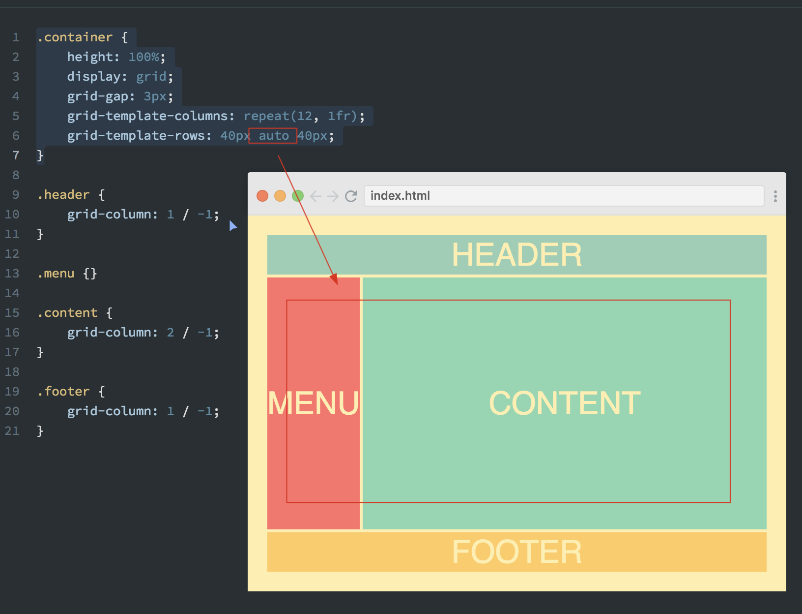
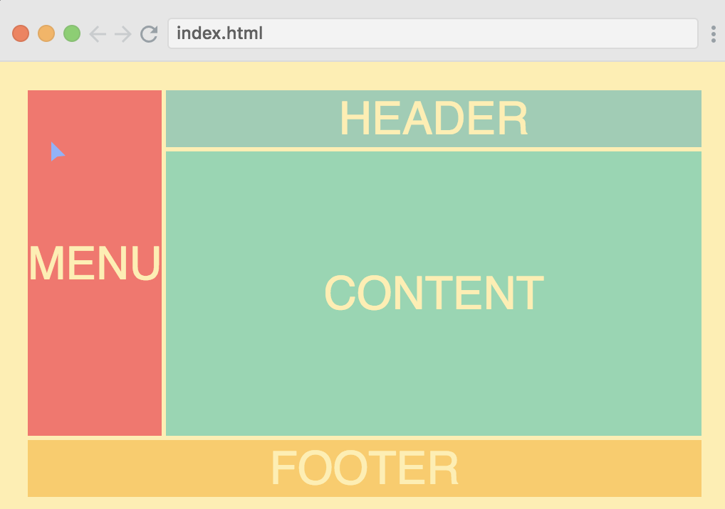
Template areas
.container {
    height: 100%;
    display: grid;
    grid-gap: 3px;
    grid-template-columns: repeat(12, 1fr);
    grid-template-rows: 40px auto 40px;
    grid-template-areas:
        "m h h h h h h h h h h h"
        "m c c c c c c c c c c c"
        "f f f f f f f f f f f f";
}

.header {
    grid-area: h;
}

.menu {
    grid-area: m;
}

.content {
    grid-area: c;
}

.footer {
    grid-area: f;
}
使用点来占位:
grid-template-areas:
        ". h h h h h h h h h h ."
        "m c c c c c c c c c c c"
        ". f f f f f f f f f f .";
Autofit and minmax
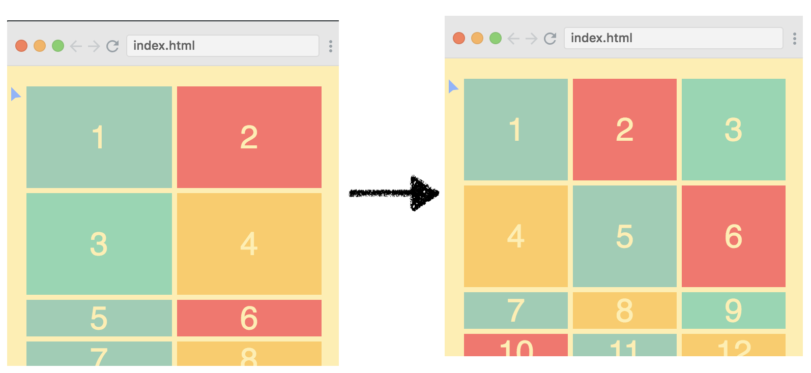
grid-template-columns: repeat(6, 100px);
grid-template-rows: repeat(2, 100px);
这种布局子控件大小 100x100, 一排6个, 共2排.
grid-template-columns: repeat(6, 1fr);使用 fr 那么子控件将会一排6个平均父控件宽度, 但这种还是不够 responsive, 如果屏幕父控件太小那么每个缩的都很小, 如果父控件很长, 那么每个也很宽.
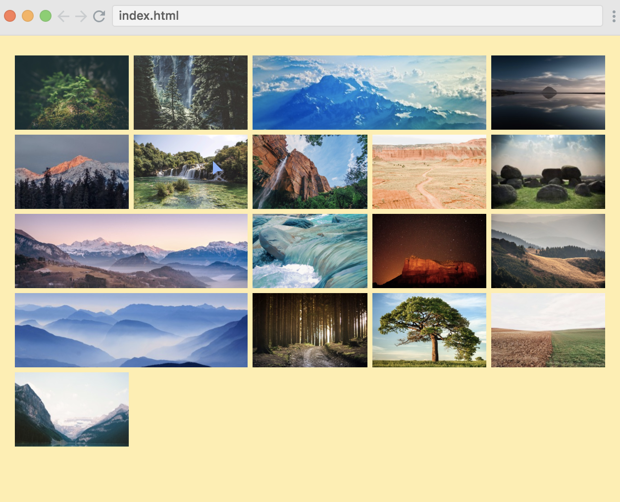
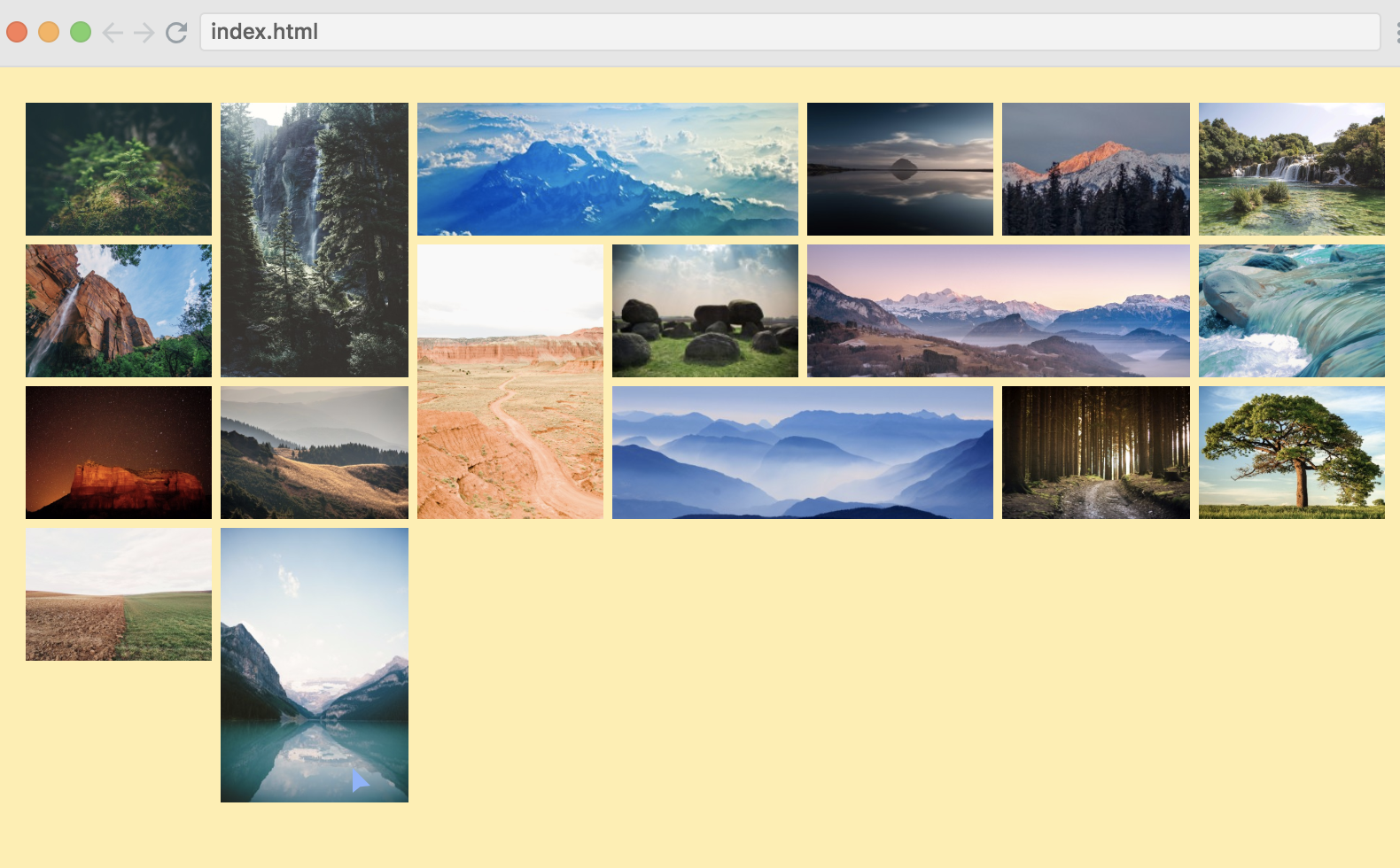
grid-template-columns: repeat(auto-fit, 100px);使用 auto-fit 可以解决自动 wrap 的问题, 如下图. 但还不完美, 宽度是死的, 不够 responsive, 图中明显可以看到右侧有余地.
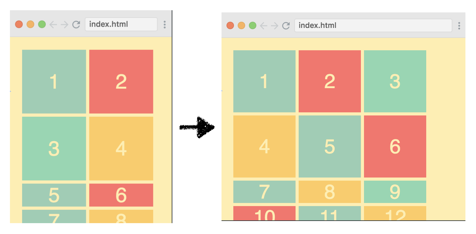
grid-template-columns: repeat(auto-fit, minmax(100px, 1fr));使用 auto-fit 和 minmax() 搭配完美解决这个问题, 每个 div 最窄 100px 最宽 1fr, 分别是在 刚好分配n个时候 和 刚好不够分配n个时候.
implicit rows
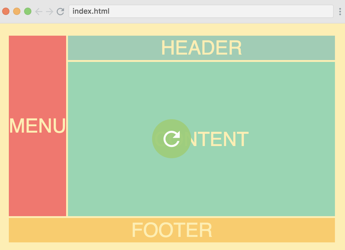
上一节解决了横向布局, 纵向布局没有做适配.
grid-template-columns: repeat(auto-fill, minmax(100px, 1fr));
grid-template-rows: 100px 150px;
这样第一行 100px 高度, 第二行 150px 高度. 那么往下的所有行都是最矮.
grid-template-rows: 100px 150px;
grid-auto-rows: 100px;
设置 grid-auto-rows 会让剩余的每行都是 100px.
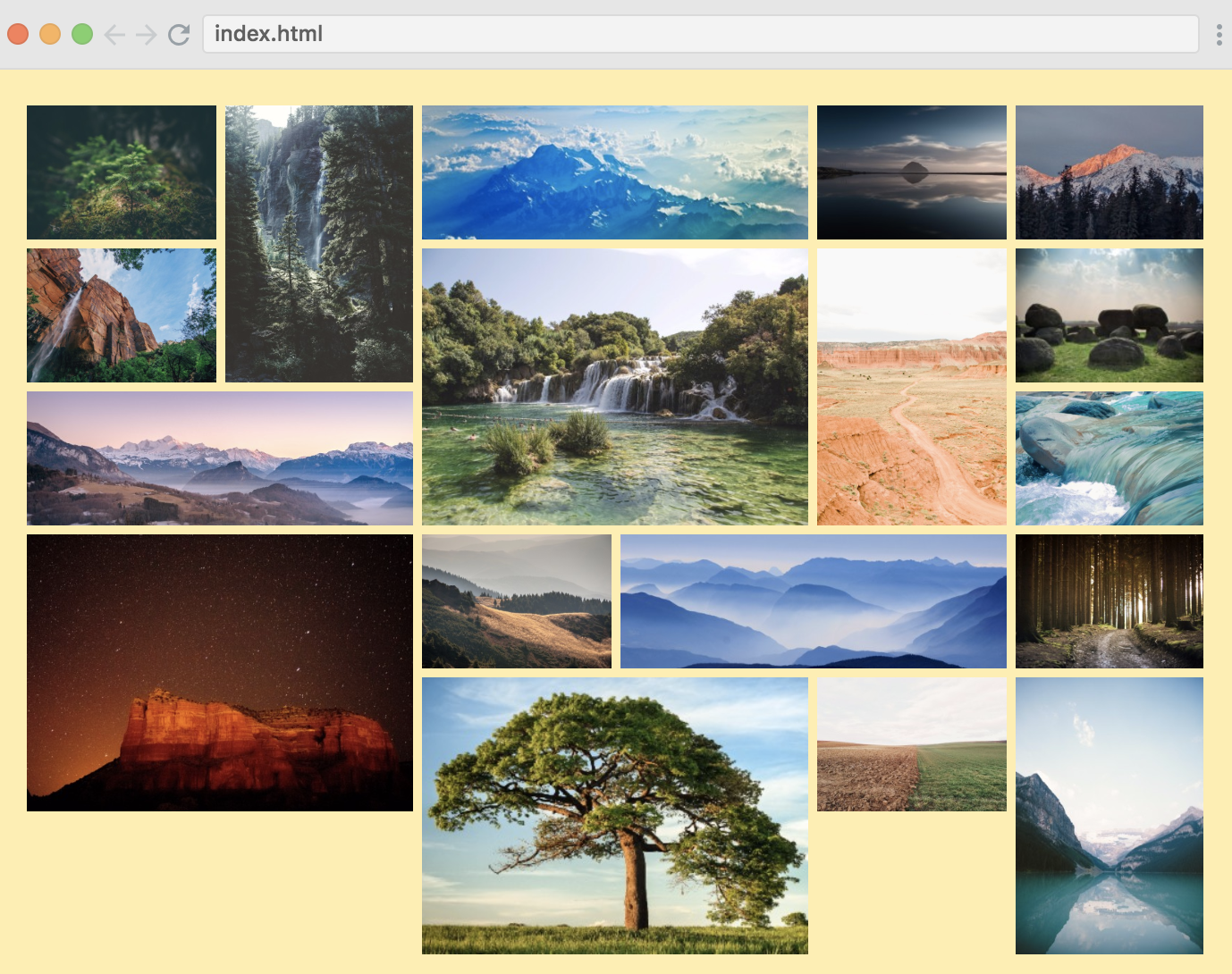
awesome image grid
上两节学的 responsive 都是指定子控件大小, 如果子控件有多种样式呢? 有的很宽, 有的很高, 有的很大?
.horizontal {
    grid-column: 1 / span 2;
}
这种横向的图片 grid-column-start 不知道填几? 那么使用 auto 吧.
.horizontal {
    grid-column: auto / span 2;
}
.horizontal {
    grid-column: span 2;
}
省略第一个, 相同的效果.
同样的, 纵向也如此设置:
.vertical {
    grid-row: span 2;
}
对于大图, 采用相同方法:
.big {
    grid-column: span 2;
    grid-row: span 2;
}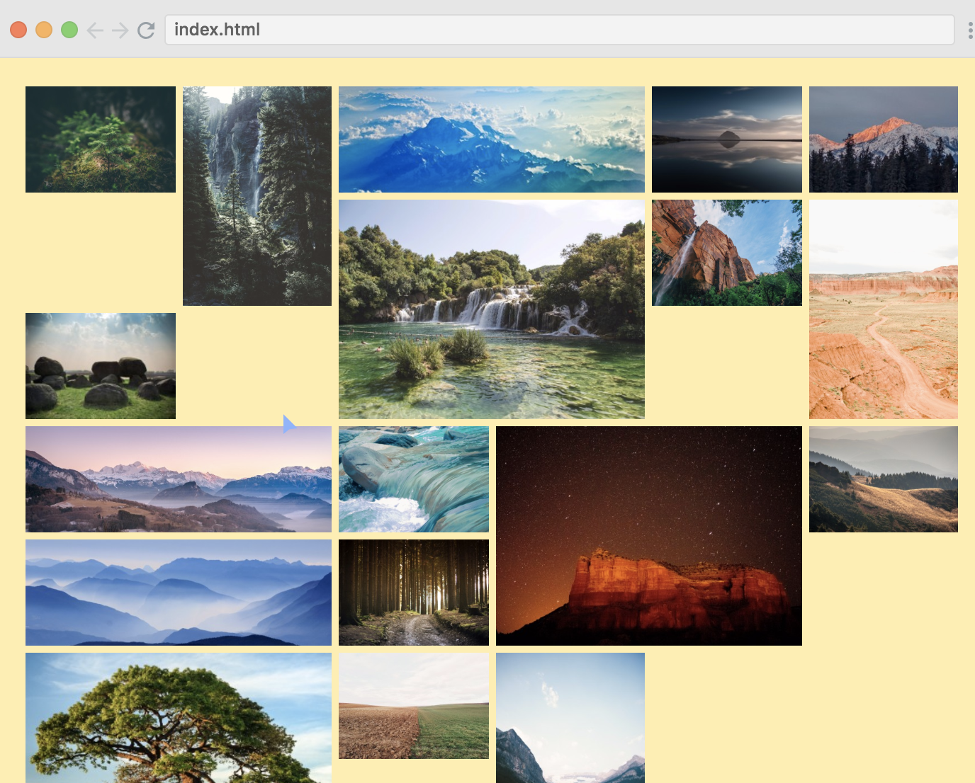
呃, 有问题了吧~
为了解决这个问题, 需要在 container 中设置 grid-auto-flow, 默认值是 row, 在这里应该使用 dense.
.container {
    display: grid;
    grid-gap: 5px;
    grid-template-columns: repeat(auto-fit, minmax(100px, 1fr));
    grid-auto-rows: 75px;
    grid-auto-flow: dense;
}
Named lines
.container {
    ...
    grid-template-columns: [main-start] 1fr [content-start] 5fr [content-end main-end];
    ...
}
.header {
grid-column: main-start / main-end;
}
.content {
grid-column: content-start / content-end;
}这里给 line 起名中间有个 dash -, 有神奇作用:
.header {
    grid-column: main;
}
.content {
    grid-column: content;
}
同样 rows 也可以这样使用:
.container {
    ...
    grid-template-columns: [main-start] 1fr [content-start] 5fr [content-end main-end];
    grid-template-rows: [main-start] 40px [content-start] auto [content-end] 40px [main-end];
}grid-row: content;
grid-column: content;同样可以省略:
grid-area: content;Justify-content & align-content
justify-content: center;
align-content: center;
和 flex 一样的效果:
对应的, justify-items, align-items, justify-self, align-self 也有, 个人感觉使用场景不多.
auto-fit vs auto-fill
grid-template-columns: repeat(auto-fit, minmax(100px, 1fr)); grid-template-columns: repeat(auto-fill, minmax(100px, 1fr));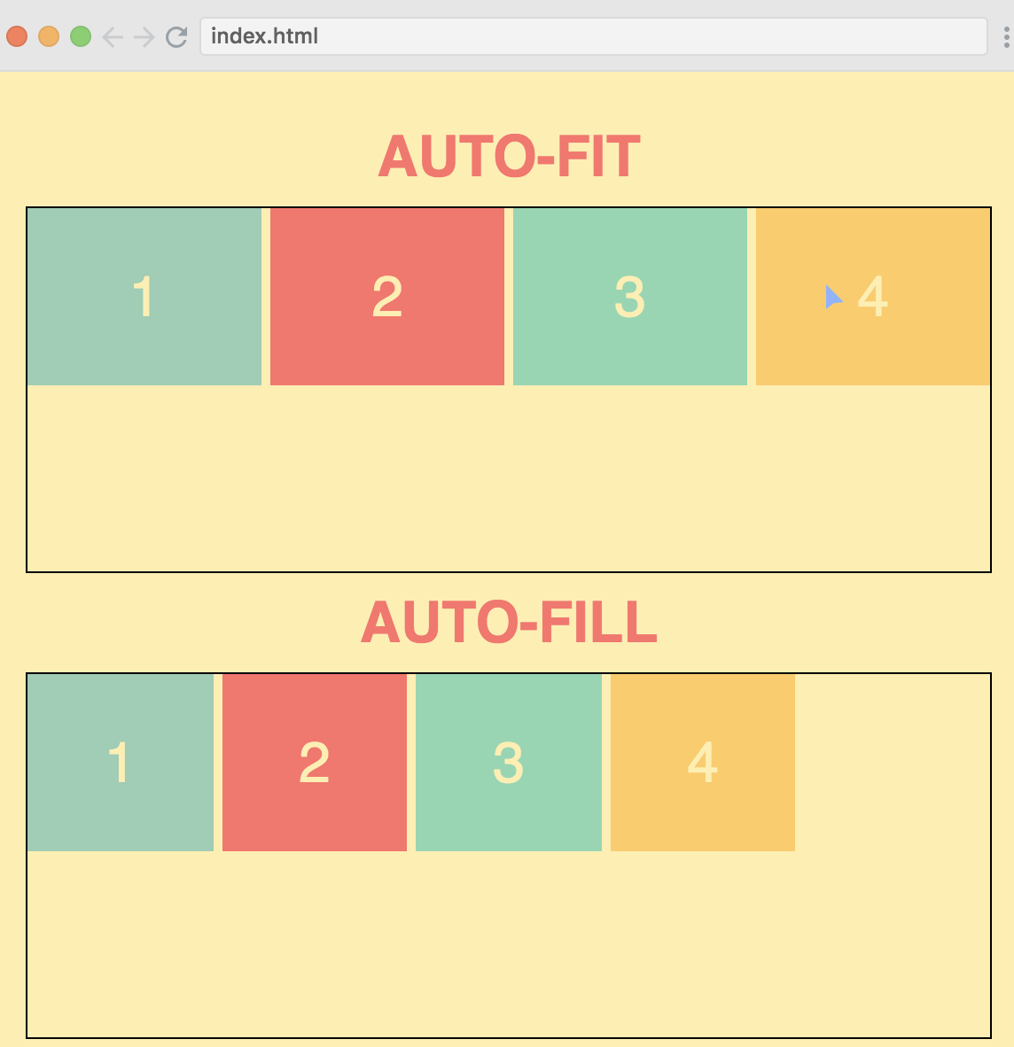


